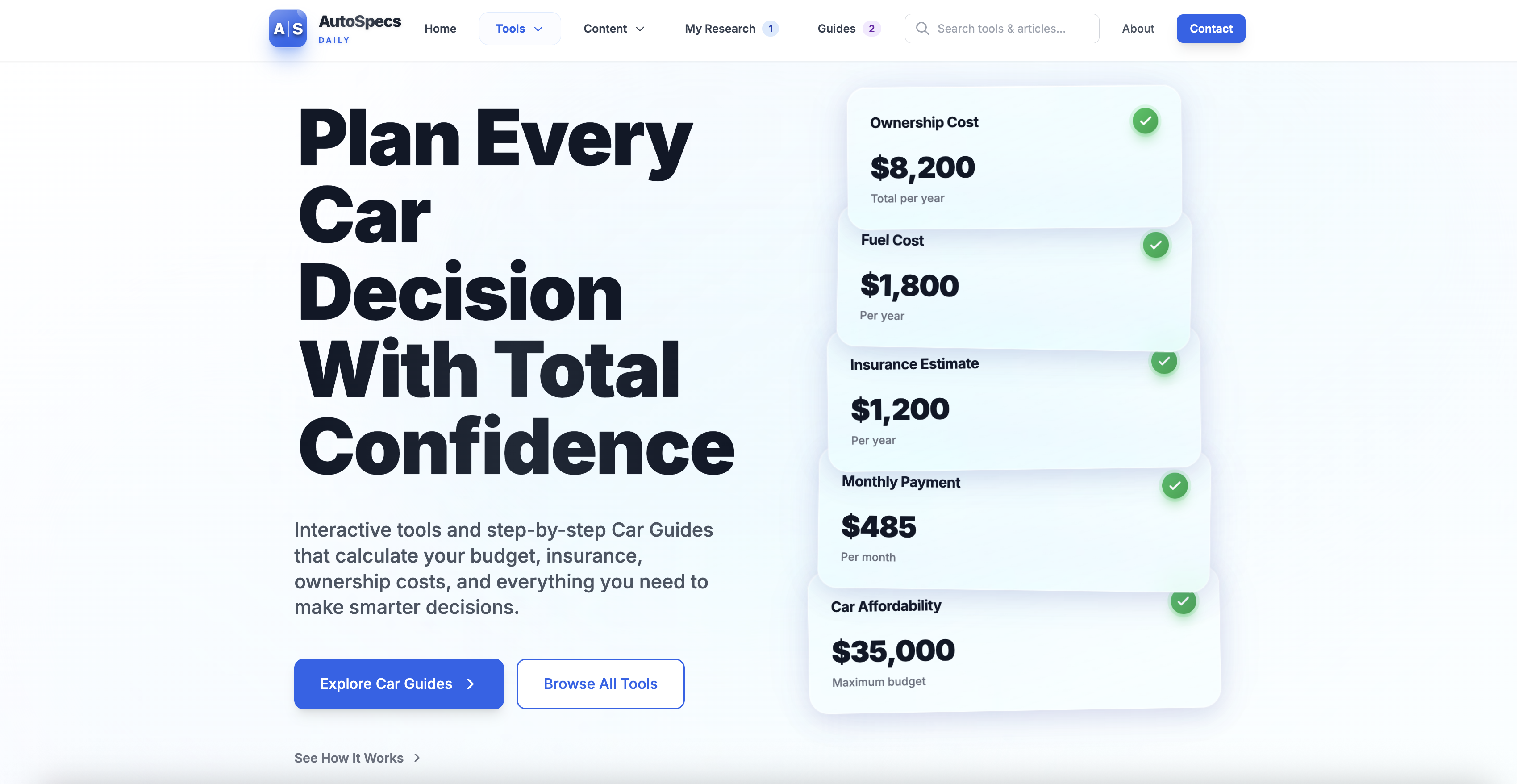
Overview
The Car Ownership Journeys system was originally designed as a lightweight set of step-by-step guides to help people navigate complex automotive decisions like buying a first car, comparing lease vs. buy, or reducing monthly ownership costs. The guides integrated on-site calculators and saved progress locally without requiring login. While functional, the experience lacked clarity, consistency, and emotional resonance.
This case study covers my complete UX research and redesign approach, including competitive insights, language and naming strategy, interaction design improvements, tool integration, and experience flow refinements. The end goal was to transform the system into a set of intuitive, motivating, and SEO-friendly Car Ownership Guides that feel practical, confidence-building, and frictionless.
Research Goals
At the start of the project, I focused on understanding:
User Behavior
How users currently approach complex car-related tasks
Mental Models
What mental models exist around "guides," "checklists," and step sequences
Competitive Patterns
Which patterns competitors use to simplify decision-making
Pain Points
Where the existing Journeys flow created confusion or friction
Insights from this research guided the full redesign of language, structure, navigation, tool integration, and progress feedback.
Competitive Landscape
I conducted a comparative analysis of four established platforms: NerdWallet, Credit Karma, Edmunds, and Carvana. Each approaches car guidance differently, but all revealed patterns valuable to our redesign.
NerdWallet
Heavily leans on long-form, SEO-driven articles structured around numbered steps. Their guides are clear and comprehensive, but not interactive and offer no progress tracking.
Tools are linked contextually, not integrated into the flow
Credit Karma
Uses short, approachable checklists that mirror user decision-making stages. Like NerdWallet, these guides are static and rely on simple headings, sequential clarity, and embedded tools.
User-friendly but lacks interactivity
Edmunds
Uses deeply detailed "10-step" style guides and successfully connects key steps to their internal tools like affordability calculators and appraisal tools.
Still, no interactive states—all progress is mental, not UI-supported
Carvana
Offers a completely different pattern: a true multi-step transactional flow with embedded tools, saved progress, and a clear path forward. Their process is low-friction, reassuring, and strongly guides the user from start to finish.
⭐ Best-in-class pattern for our redesign
💡 Key Takeaways
What All Competitors Offer:
- ✓ Steps are clear, numbered, and predictable
- ✓ Copy is actionable and user-friendly
- ✓ Tools are contextually introduced
What No Competitor Offers:
- ✗ Interactive tracking
- ✗ Automatic step completion
- ✗ A hybrid between checklist and guided planning tool
This gap validated a core design opportunity: Create a guided experience that combines the clarity of step-by-step content with the interactivity of a real planning workflow.
UX Insights & Best Practices Applied
From research, several UX principles became central to the redesign:
Clear Sequencing
A structured step list reduces cognitive load. Showing all steps at a glance creates a mental model of "how long this will take."
Actionable Copy
Users respond better to clear verbs like "Set Your Budget" or "Estimate Monthly Payments," not vague titles.
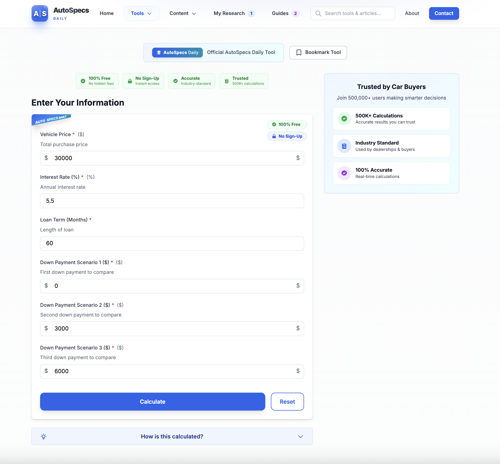
Embedded Tools
When a calculator is needed, the UI should make it incredibly obvious when to use it, why to use it, and what happens after it's used.
Visual Progress
Real-time progress indicators, checkmarks, celebratory moments, and reminders all encourage follow-through.
Zero Friction
Requiring login for progress storage kills completion rates. The existing localStorage approach aligns with UX best practices for early-stage onboarding tools.
Contextual Prompts
Users rarely start journeys from landing pages—they enter through tools and articles. Prompts should appear exactly when users need structured guidance.
Renaming the System: Moving from "Journeys" to "Guides"
User testing and competitor patterns revealed that the word "Journey" felt vague and unnecessarily poetic.
Users instinctively understood words like Guide, Plan, or Checklist.
Outcome:
Primary name: Guide
- ✓ Supports SEO (users search "car buying guide," not "car buying journey")
- ✓ Clear, simple, and matches user expectations
- ✓ Pairs well with contextual labels like "step-by-step," "interactive," or "plan"
Examples:
This naming shift alone dramatically improved user comprehension and click-through.
Redesigning the End-to-End Experience
Homepage Discoverability
The homepage now introduces Guides as a core feature, with:
- • A broader umbrella title: "Car Ownership Guides"
- • Clear subtext describing exactly what users get
- • All available guides shown in a simple grid
- • Personalized states: "Continue Guide" buttons for in-progress users, progress bars directly on cards, checkmarks on completed guides
The homepage now functions as a natural entry point without overwhelming the user.
Guides Listing Page
The /guides page was rebuilt to:
Provide a clear, humanized value proposition at the top
Display all guides in a consistent card layout
Introduce an educational "How it works" box that reduces anxiety about commitment
Improve SEO through clear headings and explanatory text
Key benefits reinforced: No login required, automatically saved progress, integrated calculators at each step
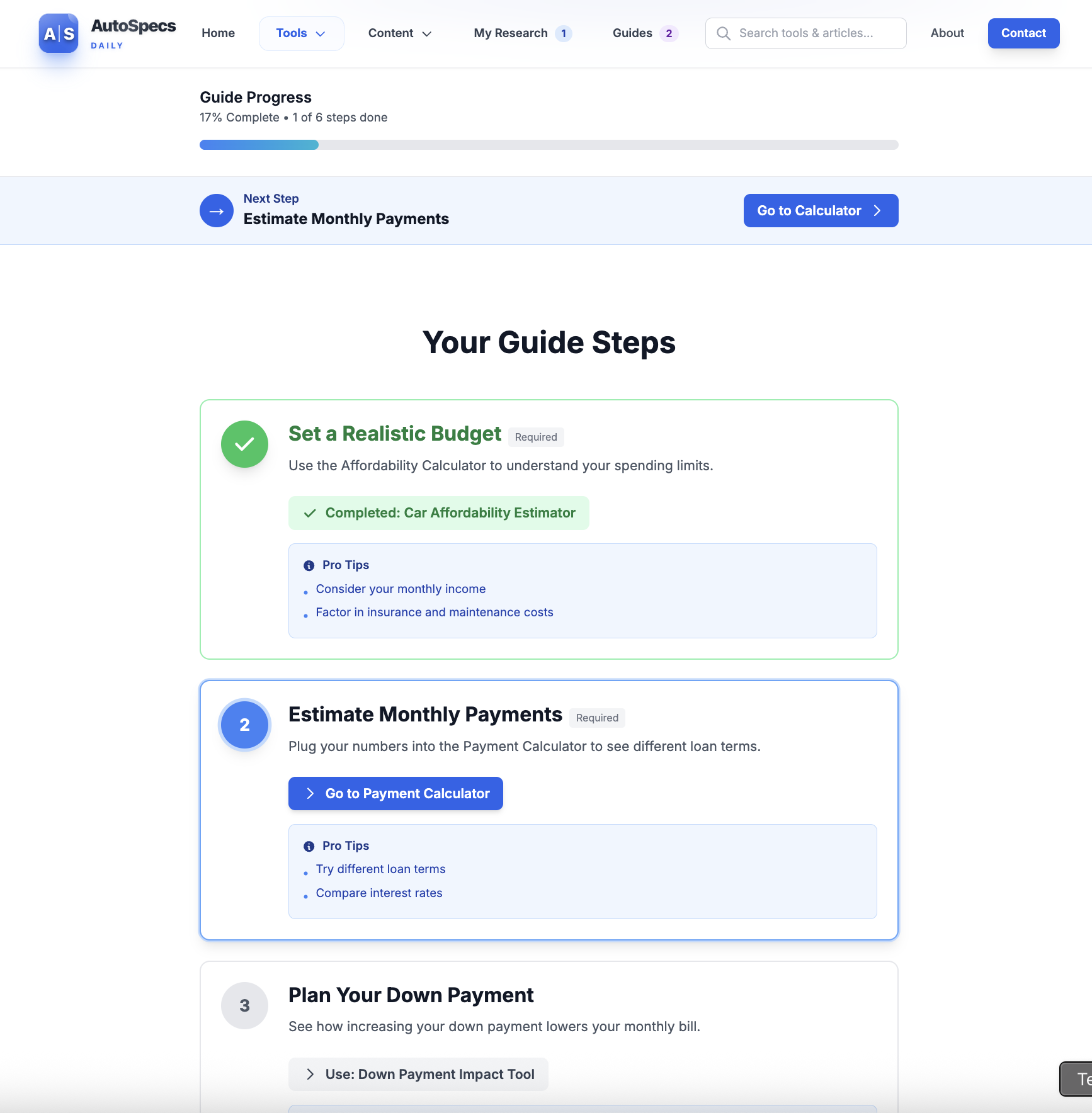
Guide Detail Page
This page saw the most significant UX transformation.
Improvements included:
- ✓ Stronger hero section with a title, icon, and concise explanation
- ✓ Highly scannable checklist layout
- ✓ Clear distinction between required steps, optional steps, automatic completion when a linked tool is used, and manual "mark complete" functionality
- ✓ Animated progress bar updates and positive reinforcement
- ✓ Completion state with congratulatory messaging, suggestions for next steps, and optional cross-promotion of related guides
This page now feels like a true roadmap—a personal plan rather than just content.
Tool Integration
A major design focus was making the calculators feel like part of the guide, not a detour.
Contextual Banners
Tools now display contextual banners when opened from a guide
Completion Toasts
After completing a calculation, a completion toast appears confirming the step is done and providing a shortcut to the next step
Ecosystem Links
Every tool shows relevant guides at the bottom with clear CTAs: "Continue your guide" or "Start the First-Time Buyer Guide"
This tightly links tools and guides into a cohesive ecosystem.
Progress Continuity and Re-engagement
To help users return and complete their plan:
The navigation now shows a badge when guides are in progress
The homepage may greet returning users with a subtle "pick up where you left off" message
Contextual prompts appear in related articles and tools
A future extension allows a short onboarding quiz to match users with the correct guide instantly
This reframes the Guides system as something worth returning to—not a one-time checklist.
Outcome & Impact
The redesigned Car Ownership Guides system now functions as a polished, modern, and deeply user-centric experience. It:
Provides clarity through structured steps
Integrates the site's calculators in a meaningful way
Encourages completion through intuitive progress feedback
Removes friction by requiring no account
Improves SEO and discoverability with user-centered naming and headings
Matches real user mental models around planning and decision making
Most importantly, it gives people a sense of control and confidence when navigating one of life's most financially significant decisions.
The experience feels like a personalized roadmap, not just a collection of tools and articles.
Ready to Explore?
Experience the redesigned Car Ownership Guides system in action