The premise
Sawa is a social dining concept focused on helping groups decide where to eat.
The challenge isn’t finding options. There are already too many. The challenge is getting people to agree.
What the product gets right
Sawa, the product, is built around three things:
- Reducing friction in group decisions
- Simplifying interaction
- Keeping flows lightweight
A group-decision product fails the moment it asks people to do work. Every extra tap, every extra screen, every “set up your profile first” is a place where someone drops out and the group breaks. The product has to feel like the lightest possible version of itself.
What I worked on
The marketing site and content structure. Not the app.
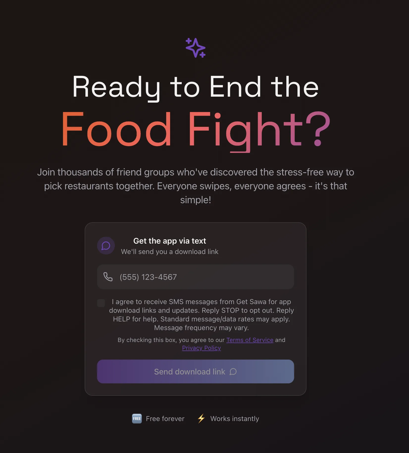
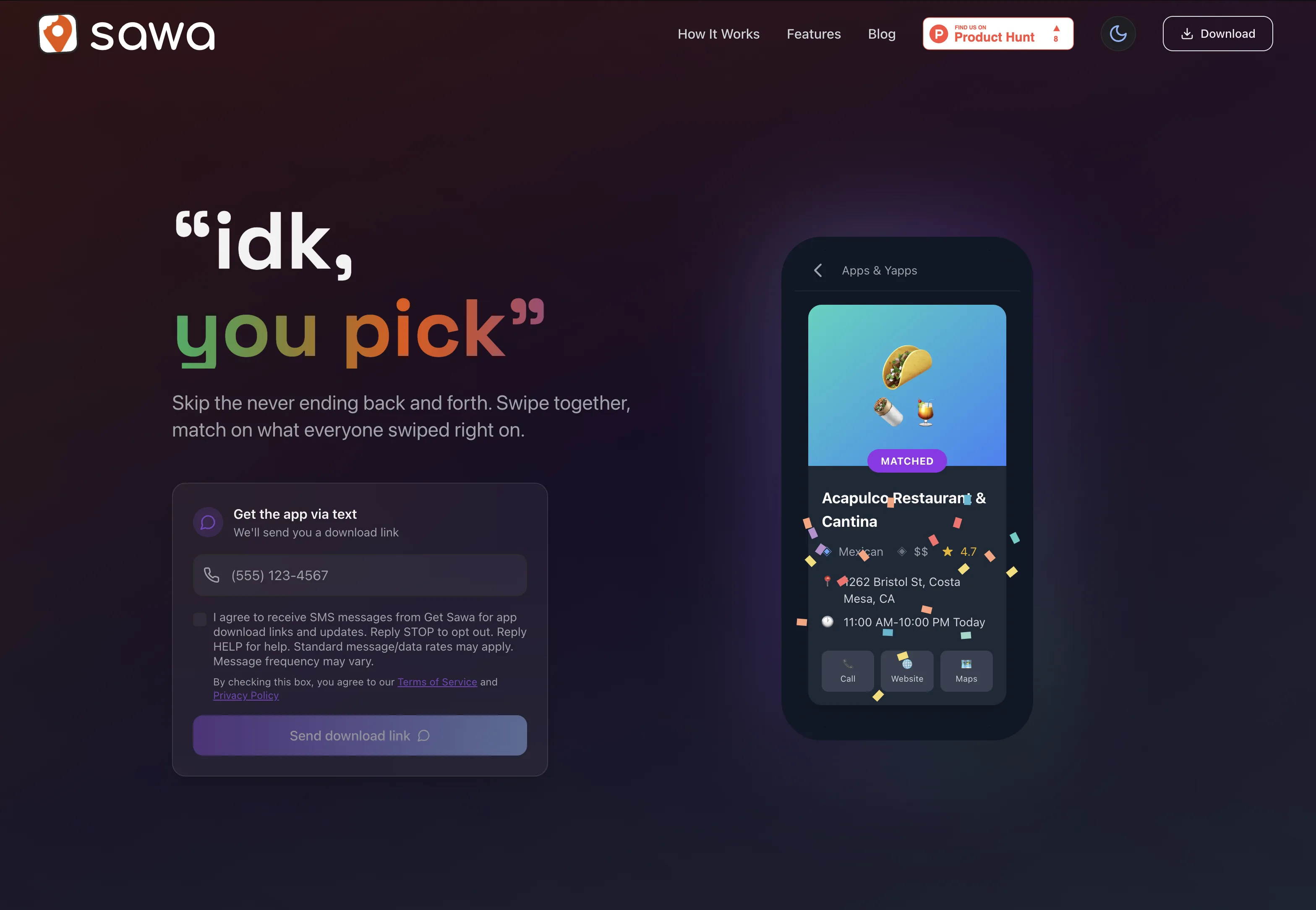
The brief was tone alignment: carry that same calm, lightweight feel into the surface that introduces the product. The first impression has to match what using Sawa actually feels like, which means the site has to be as low-friction as the thing it’s selling.
Two surfaces that do the convincing.
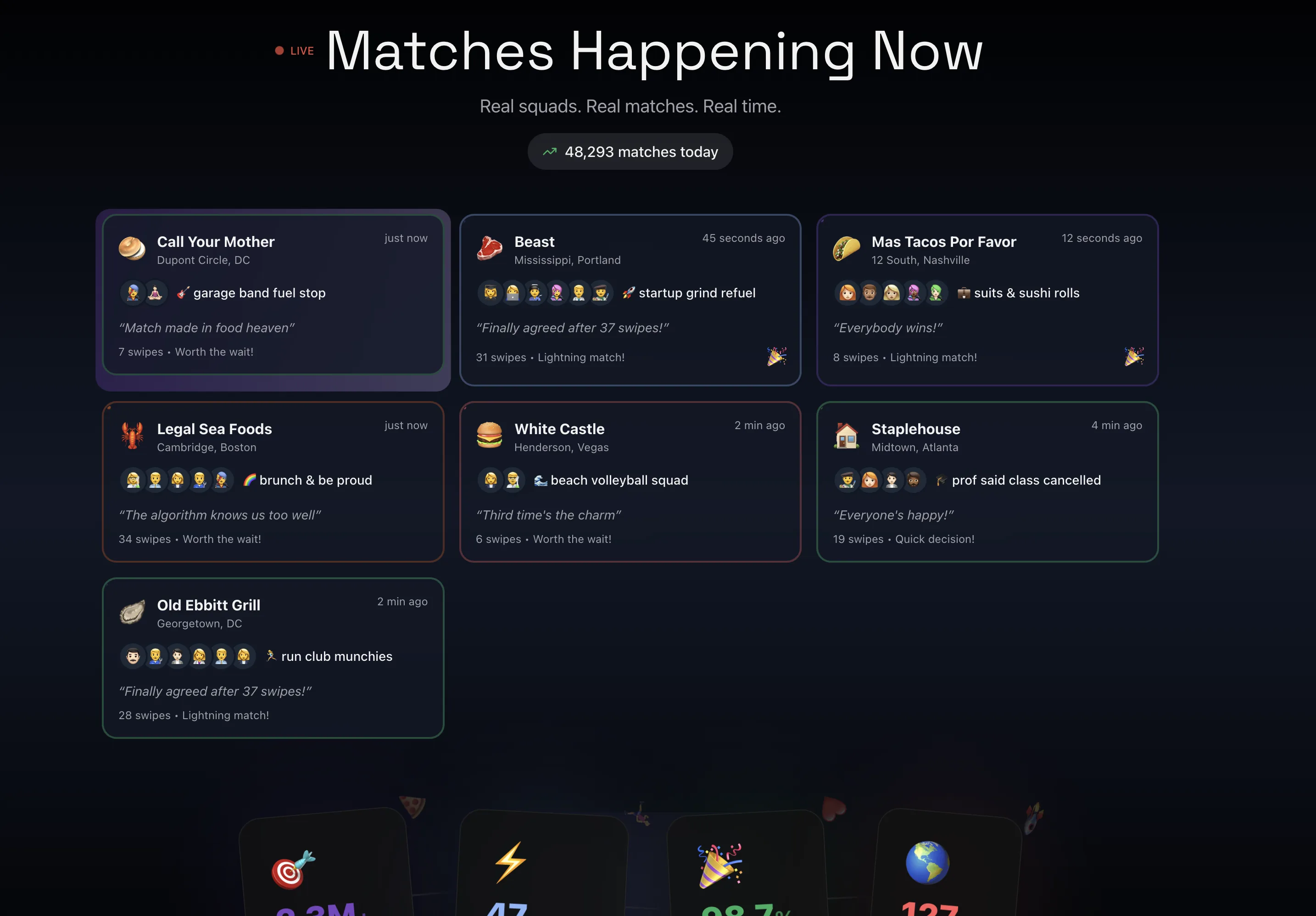
A group-decision product has to feel calm and credible before anyone installs it. The marketing site does that with two content surfaces — a live matches feed that shows the product in motion, and a curated guide section sourced from Reddit threads.
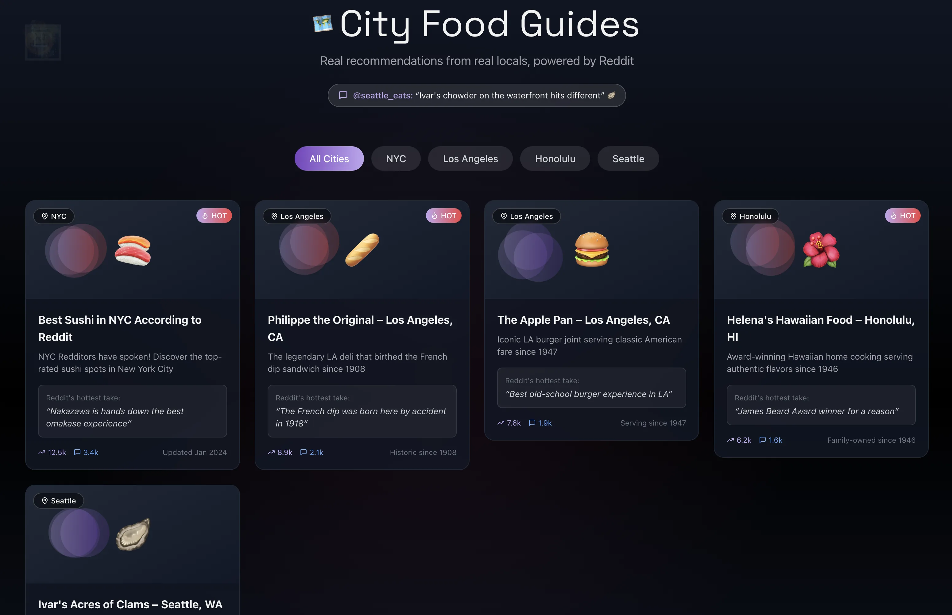
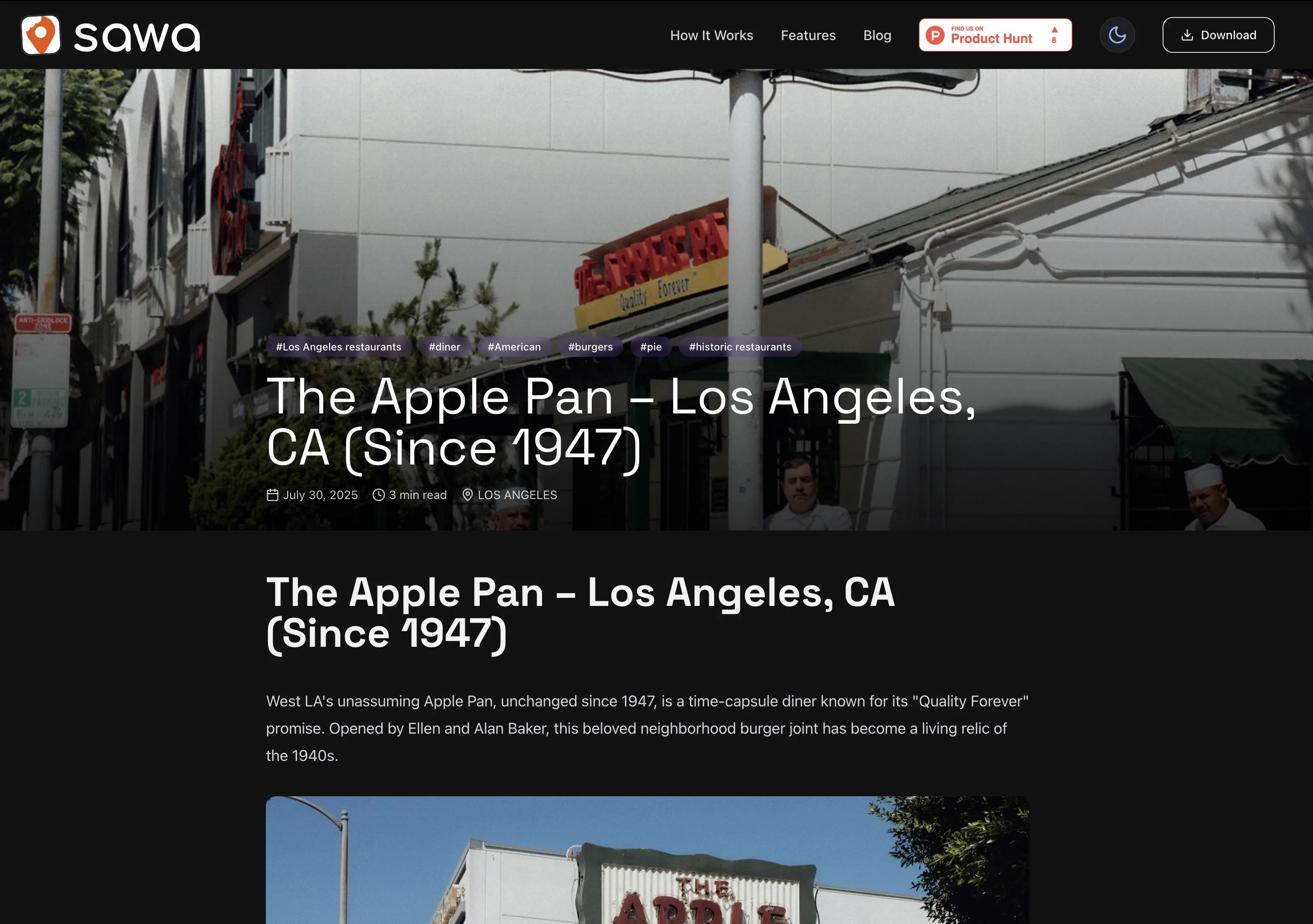
Restaurant pieces double as the install path.
Each city piece is its own page with its own URL. They earn organic traffic, hold the SEO surface for the brand, and lead the same reader into the same install prompt at the bottom.