MagTek Platform
UX and frontend systems across a multi-site enterprise platform built on a long-running ASP.NET MVC stack
- 11 Sites on shared platform
- ~85% Frontend ownership
- 100+ Shared components built
- Razor partials Component substrate

The setting
I operate across most of MagTek’s web platform: MagTek.com and a network of related sites built on the same architecture. The platform is a long-running ASP.NET MVC system that can’t be rewritten. It has to be understood, stabilized, and evolved in place. That’s the actual job.
What “platform-level” actually means
A single change has to land across more than one product surface without breaking the others. The design problem is rarely “this page”. It’s “this pattern, applied to every page that already exists, and every page that doesn’t yet.”
In practice that means:
- A shared component library on Razor partials. Detailed below.
- A rebuilt CSS foundation that scales as a real design system instead of a stylesheet that ages with the platform.
- Layout grammar that makes navigation feel coherent across properties that were never designed to share an identity.
- Performance work that respects the integrations the business depends on.
A lot of the most valuable work is invisible when it’s done right. The change you can’t see is usually the one that took the most thinking.
A component library on Razor partials
ASP.NET MVC doesn’t ship a native component model. Razor partials do, if you treat them as components instead of as include directives.
The library now sits at 100+ shared components: primitives (button, card, badge, breadcrumb, sticky sub-nav), content blocks (hero, metric row, comparison table, feature grid, callout), and layout shells (page chrome, product-page templates).
Each one is:
- Modular. One responsibility per partial. The card is the card. The hero is the hero. Nothing knows about anything it doesn’t have to.
- Strongly-typed. Every partial declares a ViewModel. Calling it from a Razor view is type-checked, the parameters are visible to IntelliSense, and a missing required field is a build error rather than a runtime surprise.
- Dynamic. Partials take parameters, render conditional regions, and compose. A hero can wrap a CTA component which wraps a button component, and the consuming view gets the typed contract for the whole stack.
- Reusable. The same hero partial drives the homepage, every product category page, the support portal landing, and Magensa’s surfaces. Once with brand variants, once with structural variants, never duplicated in markup.
That’s where the “single change lands across many pages” property comes from. Updating the spacing on the hero updates ~30 surfaces at once. Renaming a CTA prop is a compile-time error in every consumer until it’s fixed. The platform stops behaving like a stack of bespoke pages and starts behaving like a system.
Most of the work was less about authoring new components and more about extracting them carefully. Finding the patterns already in the codebase, hoisting them into partials with sensible defaults, then migrating consumers without touching production traffic. A library you can’t migrate to safely is just another stylesheet.
Modernization at the system level
Every public surface across MagTek and the related sites runs on the components, tokens, layout primitives, and conventions I built and own. A change at the system level propagates everywhere at once. A new visual treatment lands across the whole platform without a single per-page edit. A renamed prop is a compile-time error in every consumer until it’s fixed.
Mechanically:
- CSS rebuilt as a real design system. Spacing, color, type, radius, shadow, motion, all pulled into tokens. Surfaces adopt them incrementally on their own timeline. No flag day, no rewrite, just compounding consistency as each surface migrates.
- Layout primitives instead of bespoke layouts. A small set of layout shells (page chrome, content rails, sticky sub-nav scaffolds, card grids) replaces a long tail of one-off CSS. The same shells run the marketing surfaces, the product line, the subsidiary brand, the support portal, the developer pages.
- Navigation grammar that travels. Header behavior on scroll, breadcrumbs, sticky horizontal sub-navs, mobile drawers. Built once, used everywhere, behaving consistently across properties that were never originally designed to share an identity.
- Type contracts at the boundary. Every shared component declares a ViewModel; every consumer is type-checked at build. The platform stops absorbing the cost of typos and missing fields at runtime.
- Pattern systems, not pages. Comparison rows (“Old Way / vendor’s way”), metric stories, callouts, feature grids, hero variants, CTA blocks. Designed as system-level patterns the partials make trivial to drop in, so the same argument can render in dozens of places without copy-paste.
- Migration as a first-class concern. Most of the actual hours go into the work no one sees: extracting patterns from existing markup safely, hoisting them into partials with sensible defaults, then routing consumers over without breaking production traffic.
- SEO, analytics, and redirect choreography. Internal links, sitemap entries, structured-data hooks, event taxonomies, 301 maps, all sequenced so crawlers, dashboards, and downstream tools never see a discontinuity even while the system changes underneath them.
- Performance discipline. Asset budgets, render-path attention, image strategy, JS reduced to where it earns its keep. The platform serves real customers on real connections; “feels fast” is a system property, not a per-page polish step.
The screenshots that follow show what this looks like landed on specific surfaces.
Working with constraints
Long-running systems have opinions about how they want to be changed. Ignoring those opinions is how outages happen. Listening to them is how you ship things that survive.
One example. The homepage hero ran a six-slide rotating carousel that nobody finished. The straight design call was killing the slider and replacing it with a static hero on a single message. The harder problem was around it: the half-dozen marketing surfaces sized to the carousel’s dimensions, the analytics taxonomy that named events by slide number, the stakeholders who’d argued for “their” slide. The work was sequencing it. Build the static hero on a parallel route first, run it as a measurable comparison against the live page, migrate the dependent surfaces one at a time, then retire the carousel last so nothing pointed at a dead artifact.
The design decision was a single static hero with one message. The harder design decision was about how to land it without breaking the system around it.
Other work that mattered most:
- Replacing a cluster of one-off layouts with a small set of layout primitives, without touching production traffic.
- Moving spacing, color, and type into tokens that the rest of the platform could adopt incrementally on its own timeline.
- Sequencing navigation changes so internal links, SEO, and analytics didn’t drift during the transition.
Pattern-driven product pages.
The hardware portfolio spans card readers, OEM components, check scanners, and issuance hardware. Each category needed its own surface without forcing buyers to relearn the layout.
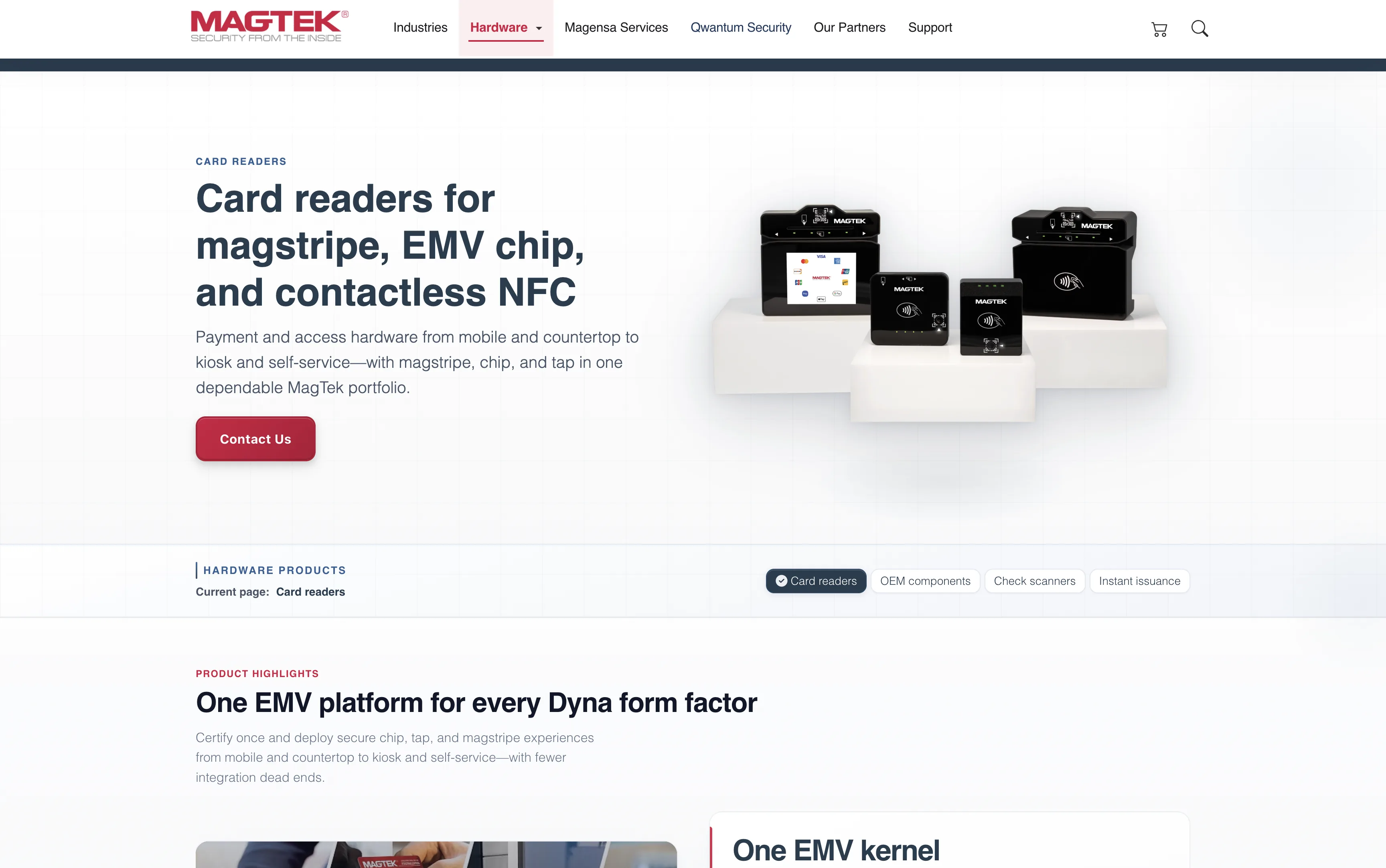
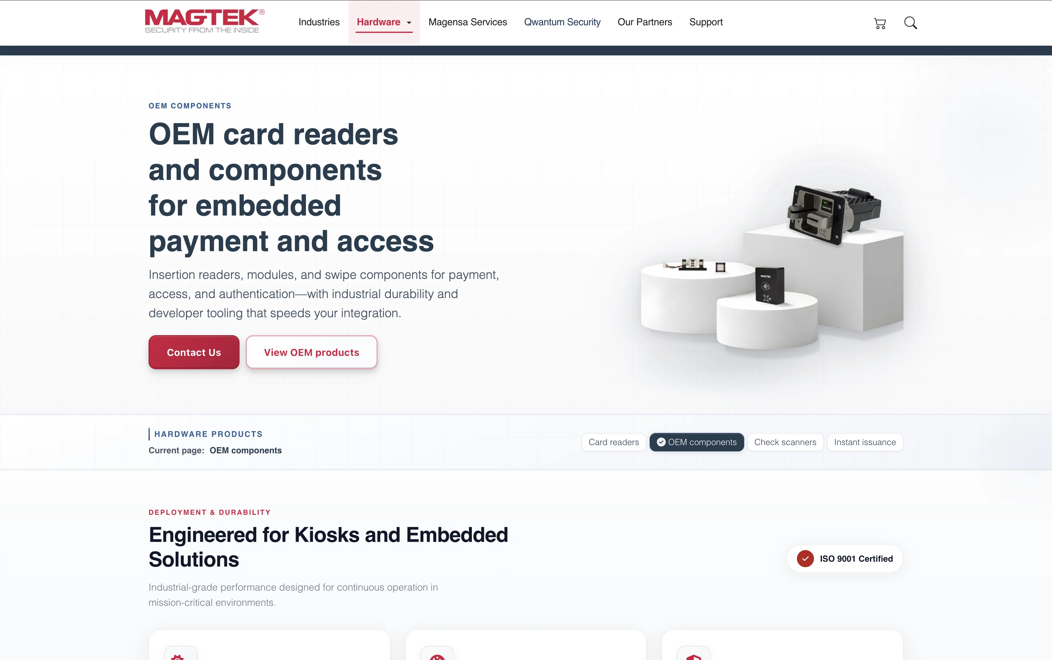
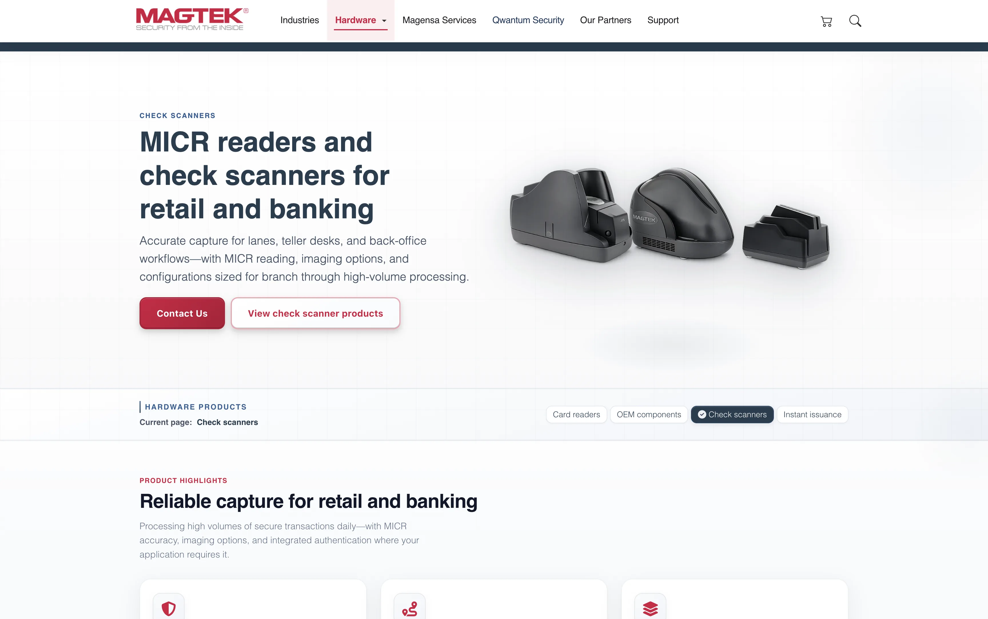
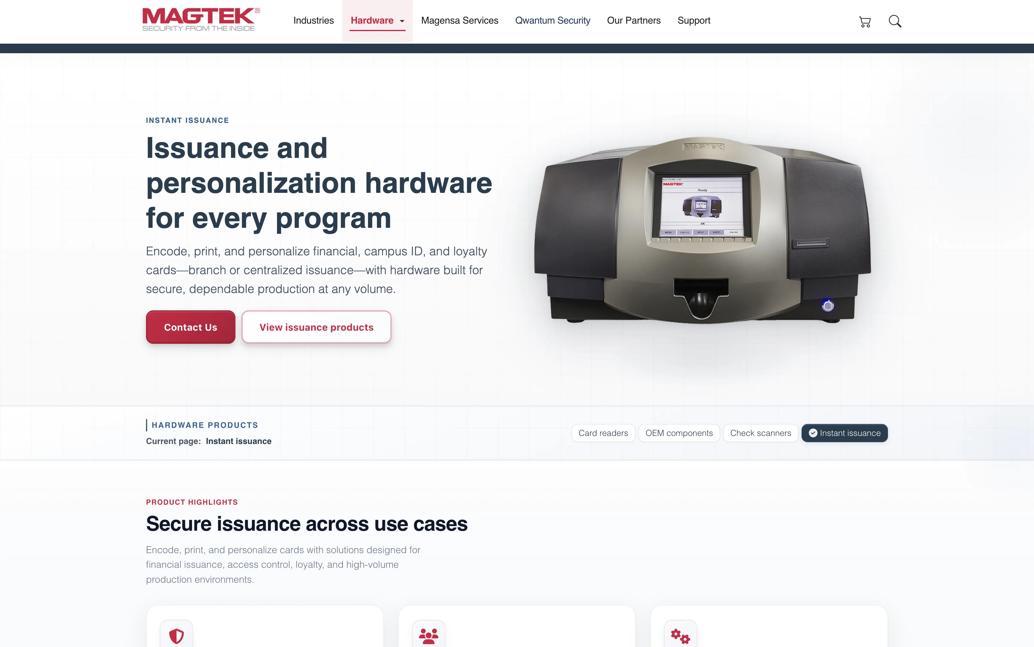
The same template carries every category. Eyebrow, title, buyer-facing copy on the left. Product photography on the right. Twin CTAs: "Contact Us" and "View products". Below the hero, a sticky horizontal sub-nav keeps the four hardware categories one click apart with the current section highlighted. A buyer who lands on Card readers from search can scan adjacent categories without round-tripping through the main nav. The product page stops being a destination and starts behaving like a shop floor.
A subsidiary that needed to feel its own.
Magensa carries its own product identity inside the MagTek family: gateway, eCommerce, tokenization, PIN services, reader management. The brief was to keep it inside the family without making it feel like the same site with a recolored stripe.

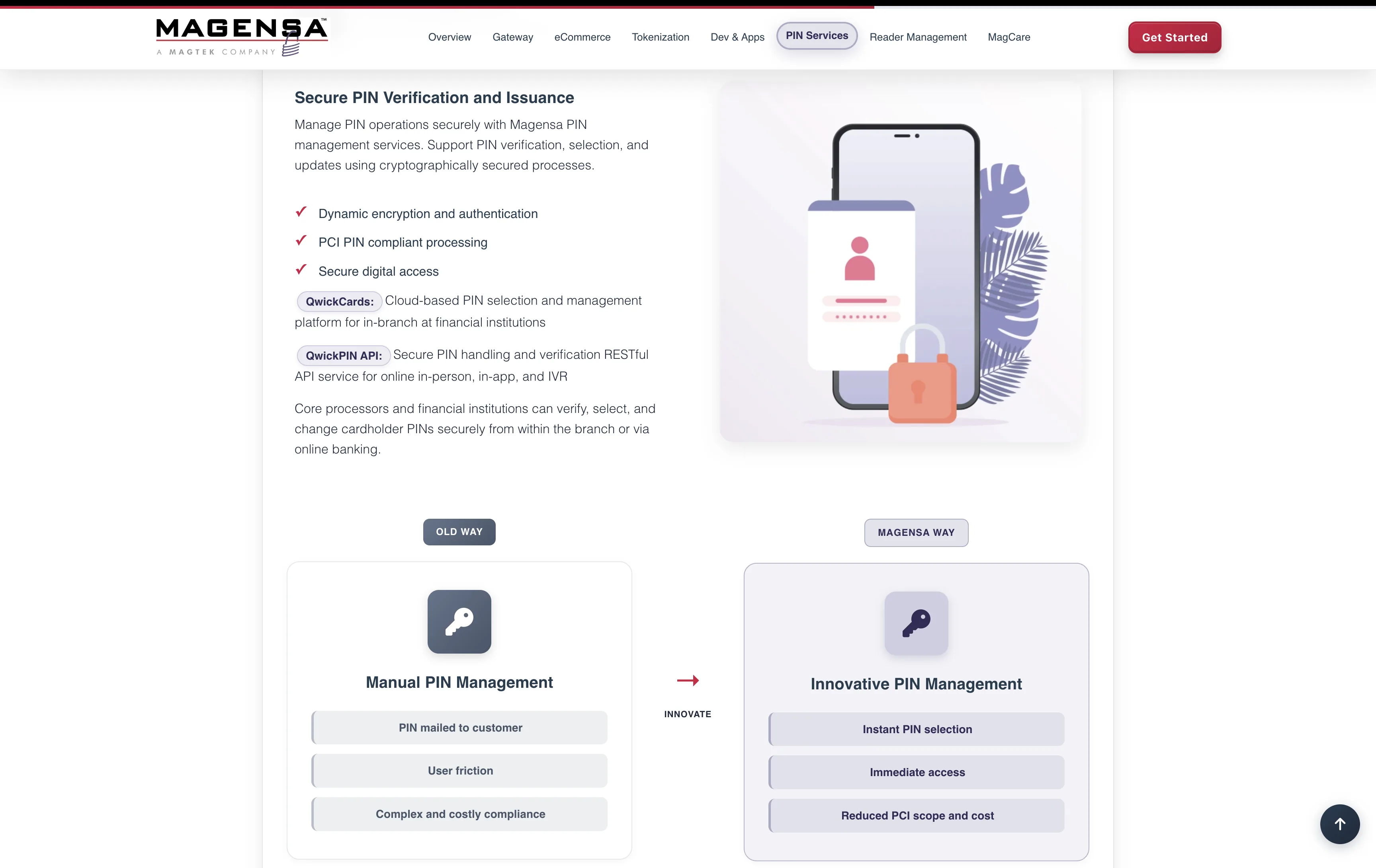
The "Old Way / Magensa Way" comparison runs across the product pages. A visual structure that carries the sales argument without paragraphs of marketing copy. The subsidiary feels like its own product because it is one, and the design treats it that way.