The setting
Most engineering case studies are about greenfield. This isn’t.
I operate across most of MagTek’s web platform: MagTek.com and a network of related sites built on the same architecture. The platform is a long-running ASP.NET MVC system that can’t be rewritten. It has to be understood, stabilized, and evolved in place.
You can’t brute-force improvements in a system like this. You have to work with it.
That’s where most of my work sits.
What “platform-level” actually means
It means a single change has to land across more than one product surface without breaking the others. The design problem is rarely “this page”. It’s “this pattern, applied to every page that already exists, and every page that doesn’t yet.”
Specifically:
- A shared Razor component library, modular and strongly typed, that moves the platform off page-specific markup. Development is faster, the result is more consistent.
- A rebuilt CSS foundation that scales as a real design system instead of a stylesheet that ages with the platform.
- Layout grammar that makes navigation feel coherent across properties that were never designed to share an identity.
- Performance work that respects the integrations the business depends on.
A lot of the most valuable work is invisible when it’s done right. The change you can’t see is usually the one that took the most thinking.
Surfaces I’ve shipped within the platform
Homepage rebuild
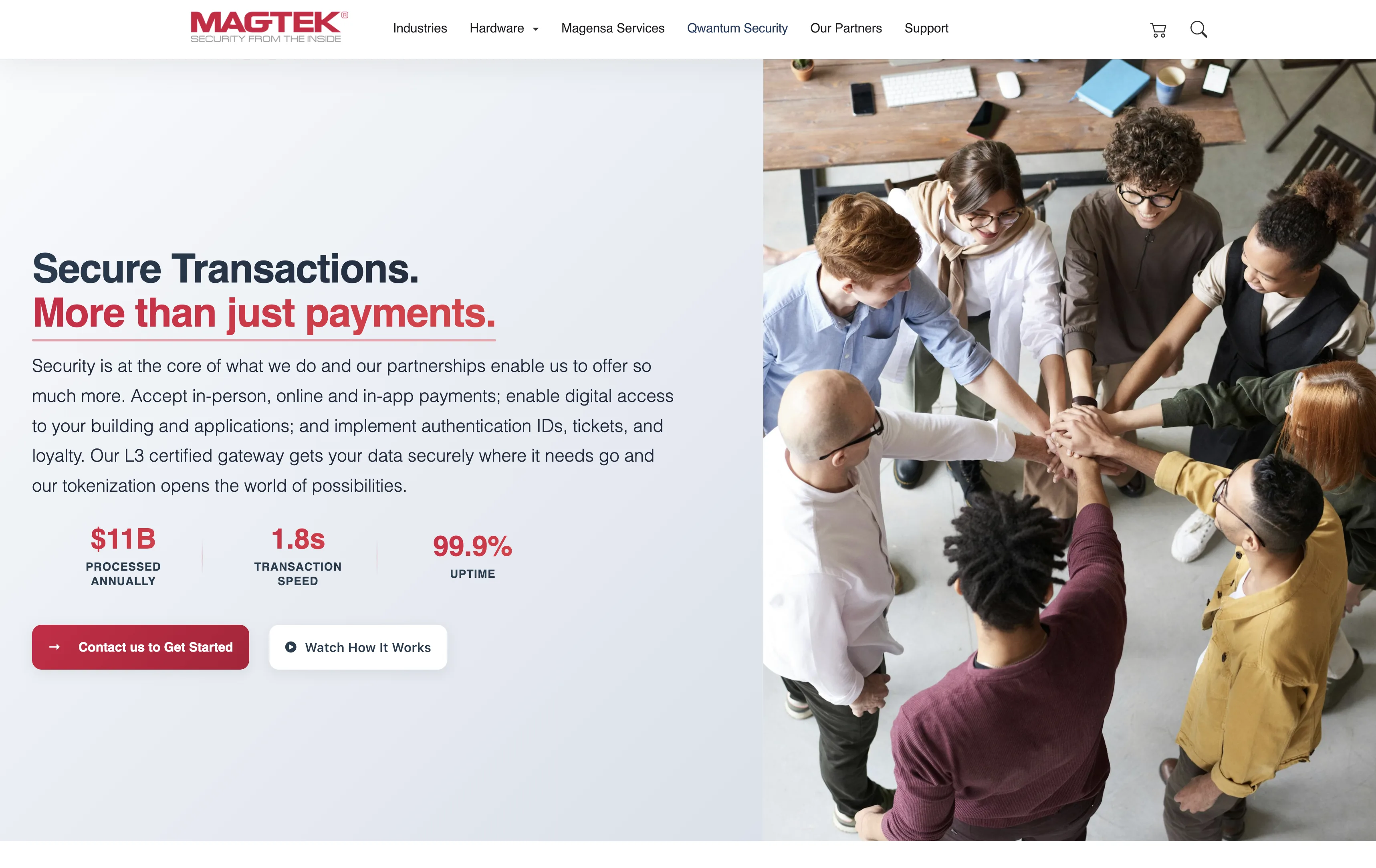
The homepage needed to communicate a complex product ecosystem clearly. It’s the highest-traffic entry point and the place most users decide whether they’re in the right place.
The work was hierarchy. Which message comes first. Which paths get visual weight. Which ones get demoted. The goal wasn’t a visual refresh. It was a homepage that answers am I in the right place before the visitor scrolls.
The patterns introduced here became reusable across the rest of the platform: section structures, hierarchy rules, and a navigation grammar that the other properties have since adopted.
Support portal
The portal had good content but poor usability. That’s a common pattern in long-running platforms. The information exists; the structure doesn’t. Users spend more time finding answers than reading them, which means most of them give up and contact support. That’s exactly the outcome the portal is supposed to prevent.
The work focused on reducing friction in finding answers, improving layout consistency, and restructuring content organization around how users actually arrive, usually from a specific error, product, or question. Categories were rebuilt around the user’s mental model, not the org chart. Layout patterns were standardized so that every article looks, scrolls, and behaves the same way.
Less searching, more finding.
Working with constraints, not against them
Long-running systems develop strong opinions about how they want to be changed. Ignoring those opinions is how outages happen. Listening to them is how you ship things that survive.
One example. The homepage hero ran a six-slide rotating carousel that nobody finished. The straight design call was killing the slider and replacing it with a static hero on a single message. The harder problem was around it: the half-dozen marketing surfaces sized to the carousel’s dimensions, the analytics taxonomy that named events by slide number, the stakeholders who’d argued for “their” slide. The work was sequencing it. Build the static hero on a parallel route first, run it as a measurable comparison against the live page, migrate the dependent surfaces one at a time, then retire the carousel last so nothing pointed at a dead artifact. The design decision was a single static hero with one message. The harder design decision was about how to land it without breaking the system around it.
Some of the other work that mattered most:
- Replacing a cluster of one-off layouts with a small set of layout primitives, without touching production traffic.
- Moving spacing, color, and type into tokens that the rest of the platform could adopt incrementally, on its own timeline.
- Sequencing navigation changes so that internal links, SEO, and analytics didn’t drift during the transition.
None of this is glamorous. All of it compounds.
AI in the workflow
More recently, I’ve been integrating AI into the workflow where it pays off. Cursor and Claude speed up iteration, structure development, and reduce friction in the repetitive parts.
It’s not a feature inside the product. It’s part of how the platform itself gets built and maintained, with a human still owning every decision that ships.
Pattern-driven product pages.
The hardware portfolio spans card readers, OEM components, check scanners, and issuance hardware. Each category needed its own surface without forcing buyers to relearn the layout.
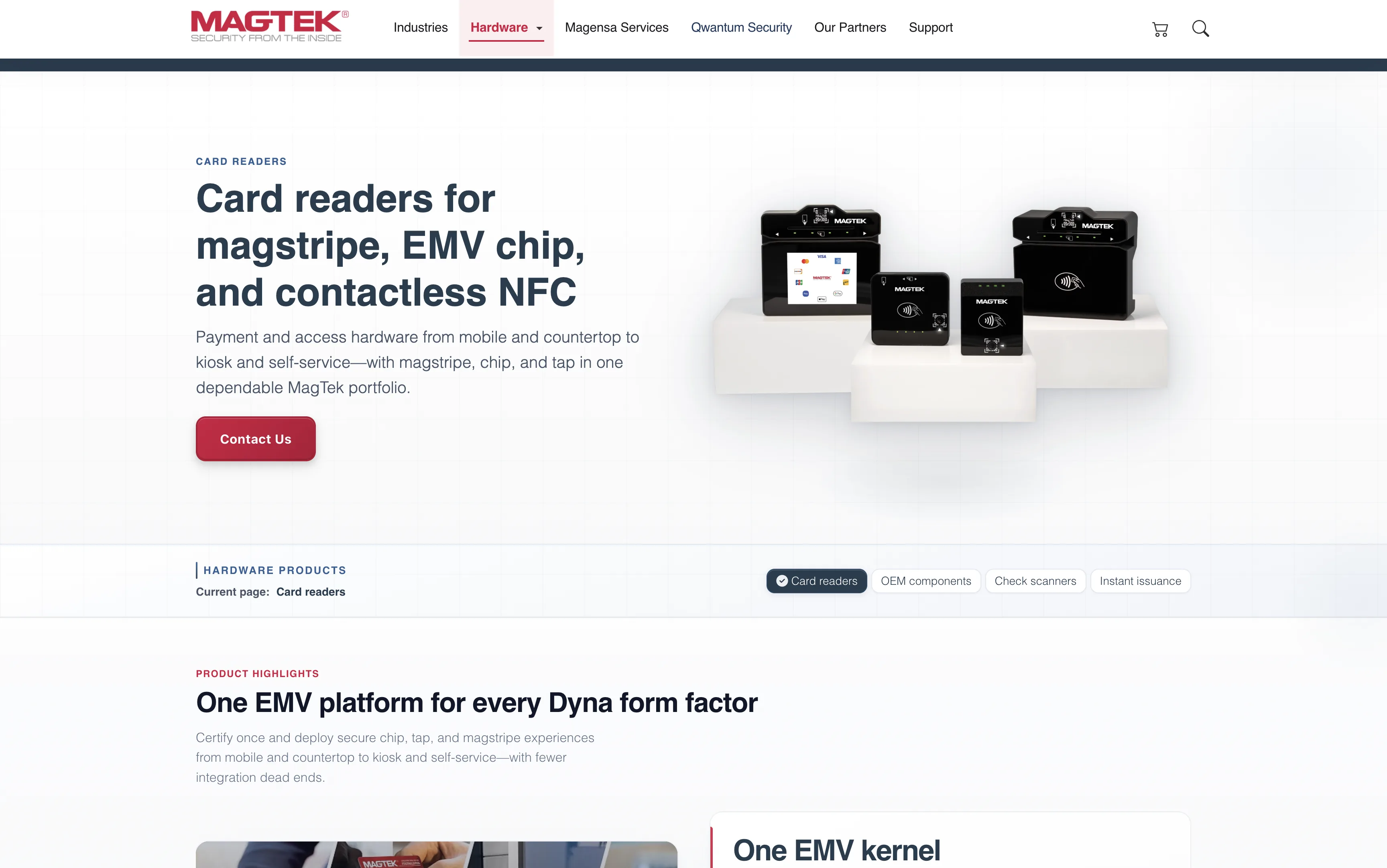
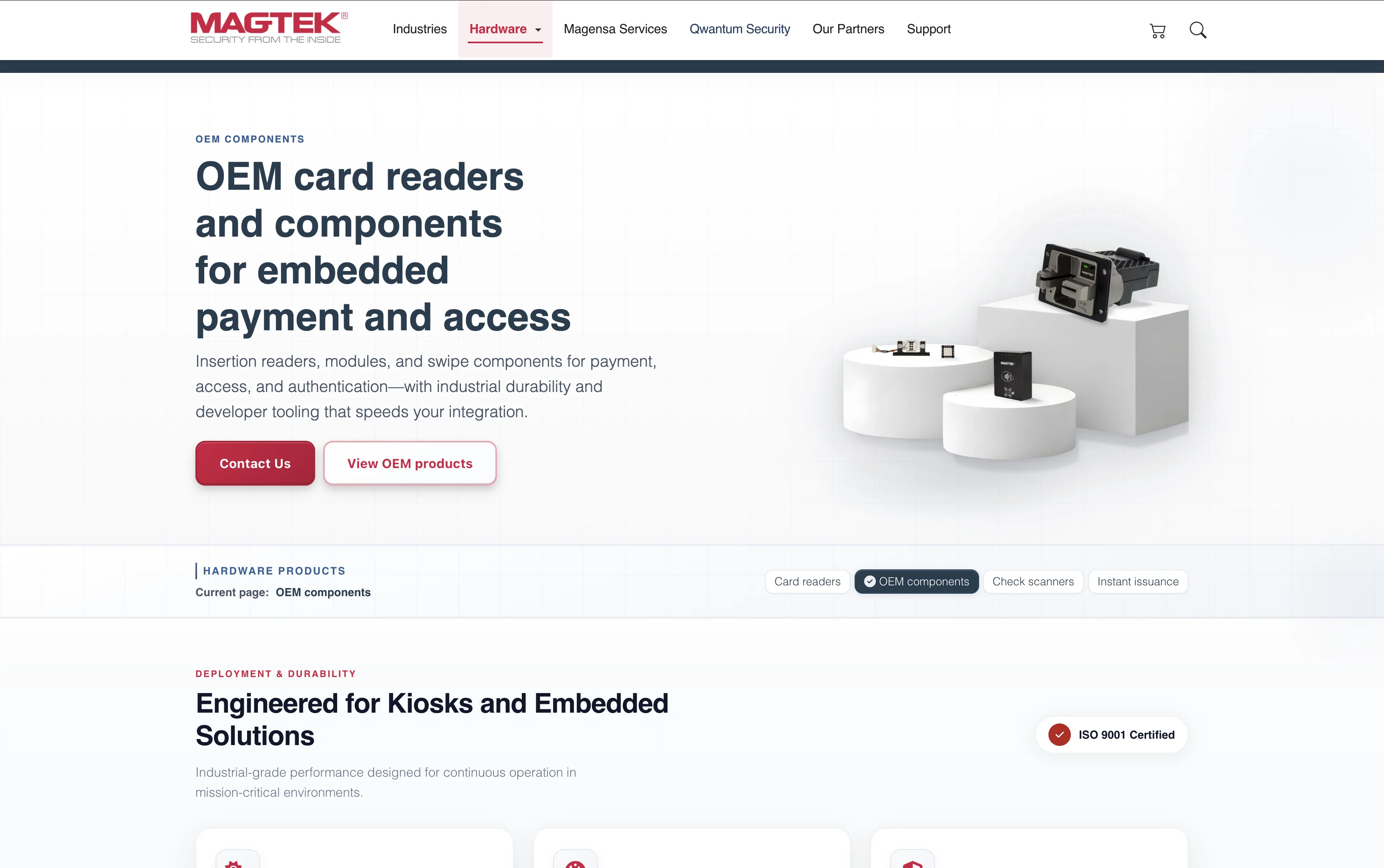
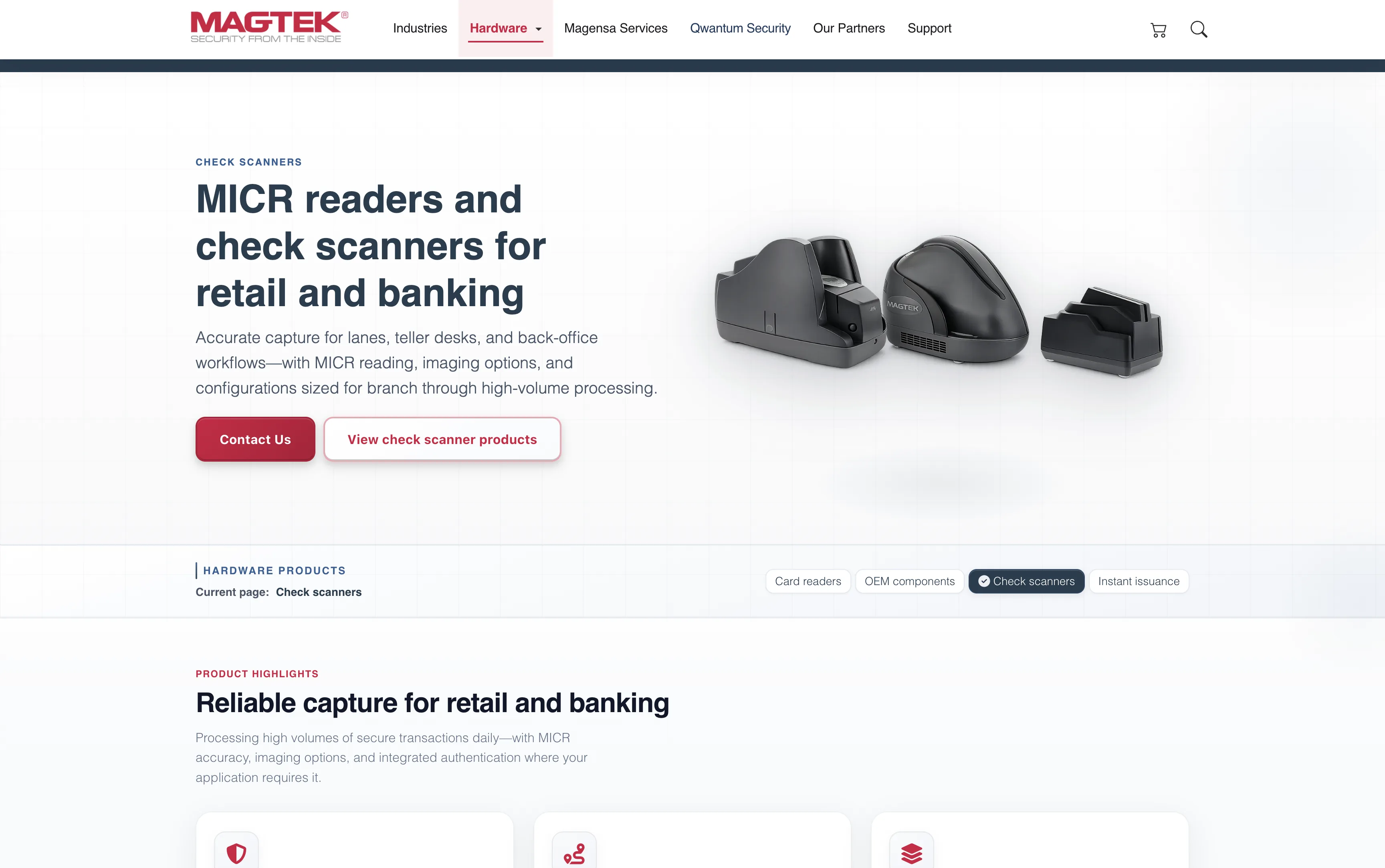
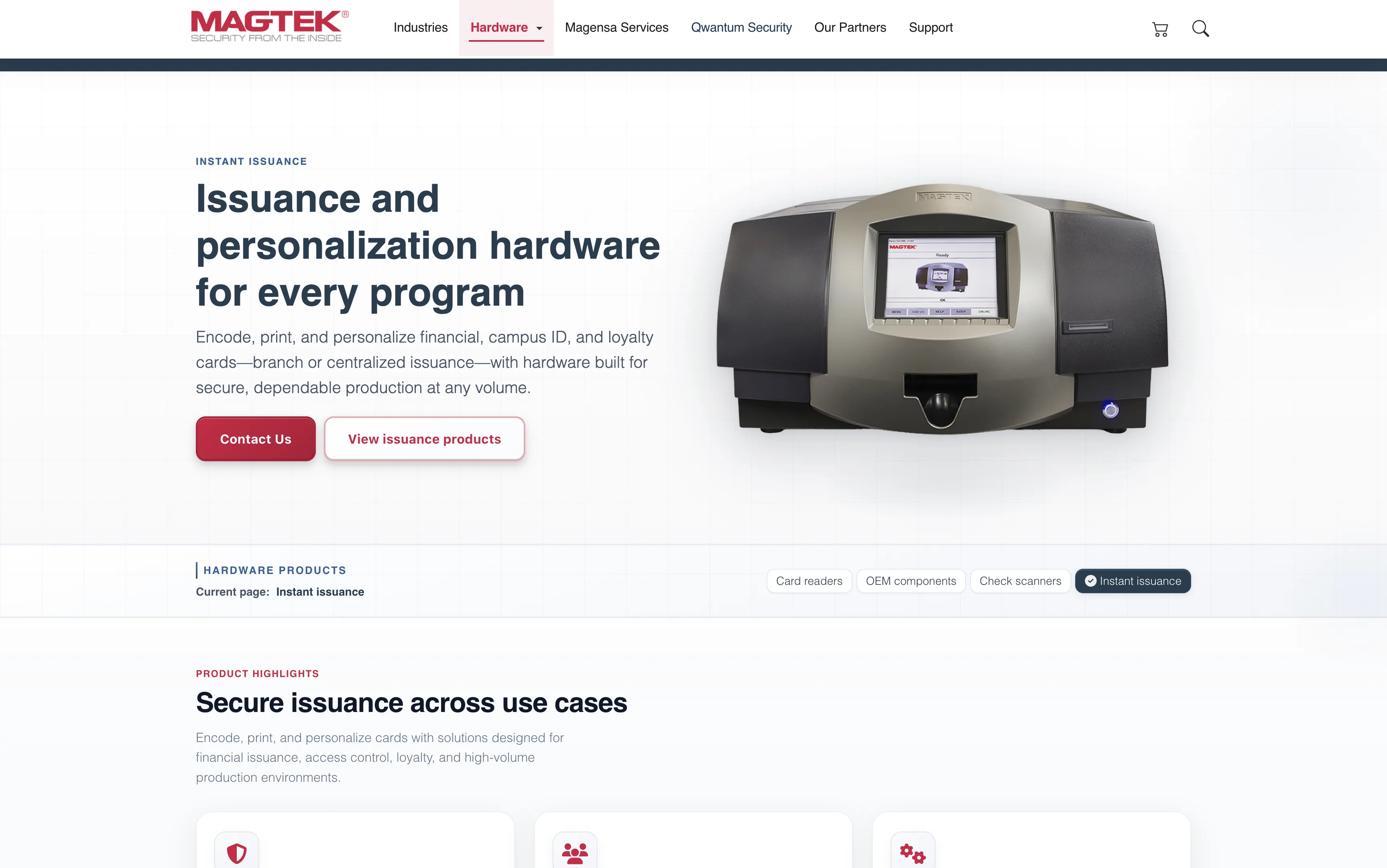
The same template carries every category. Eyebrow, title, buyer-facing copy on the left. Product photography on the right. Twin CTAs: "Contact Us" and "View products". Below the hero, a sticky horizontal sub-nav keeps the four hardware categories one click apart with the current section highlighted. A buyer who lands on Card readers from search can scan adjacent categories without round-tripping through the main nav. The product page stops being a destination and starts behaving like a shop floor.
A subsidiary that needed to feel its own.
Magensa carries its own product identity inside the MagTek family — gateway, eCommerce, tokenization, PIN services, reader management. The brief was to keep it inside the family without making it feel like the same site with a recolored stripe.
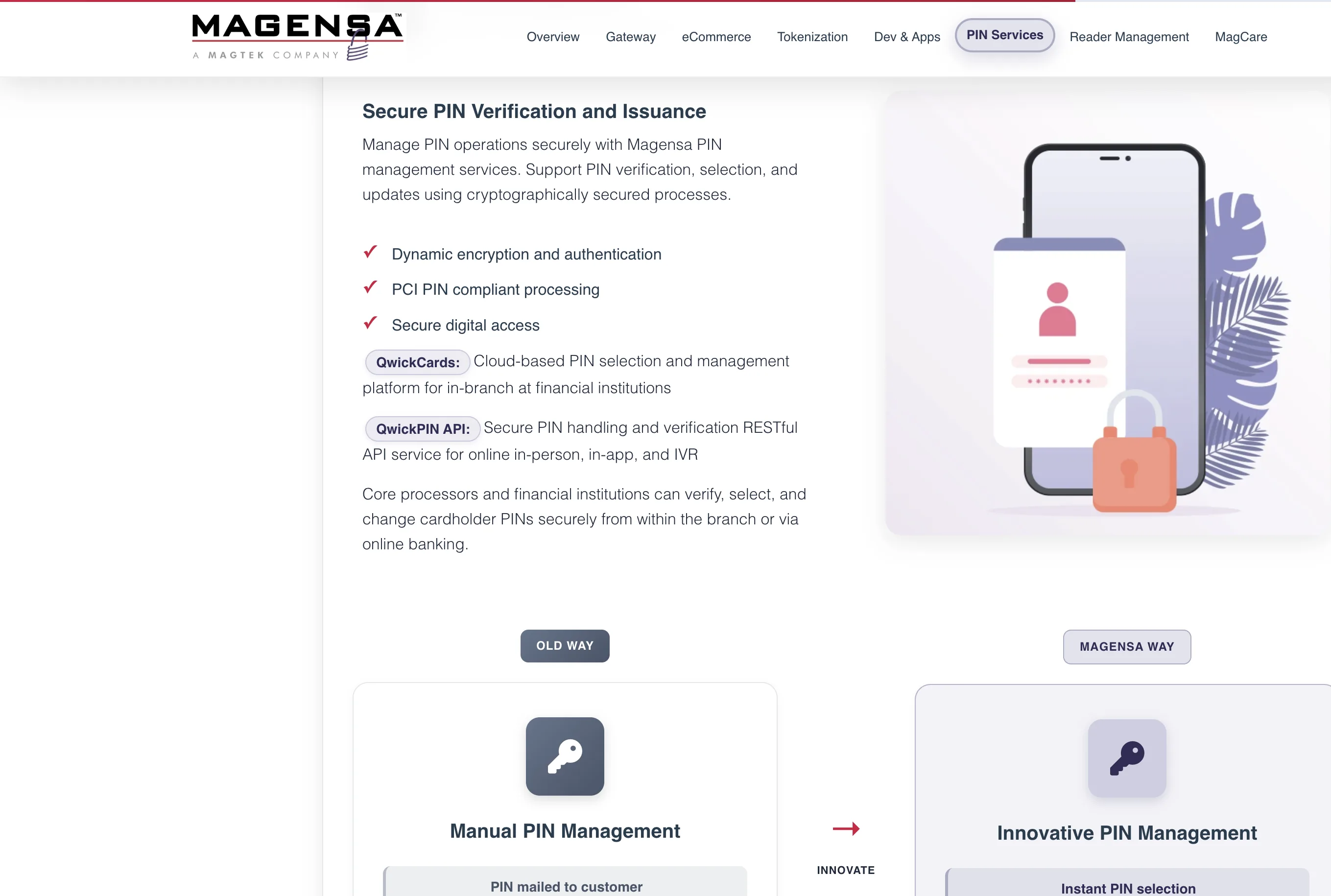
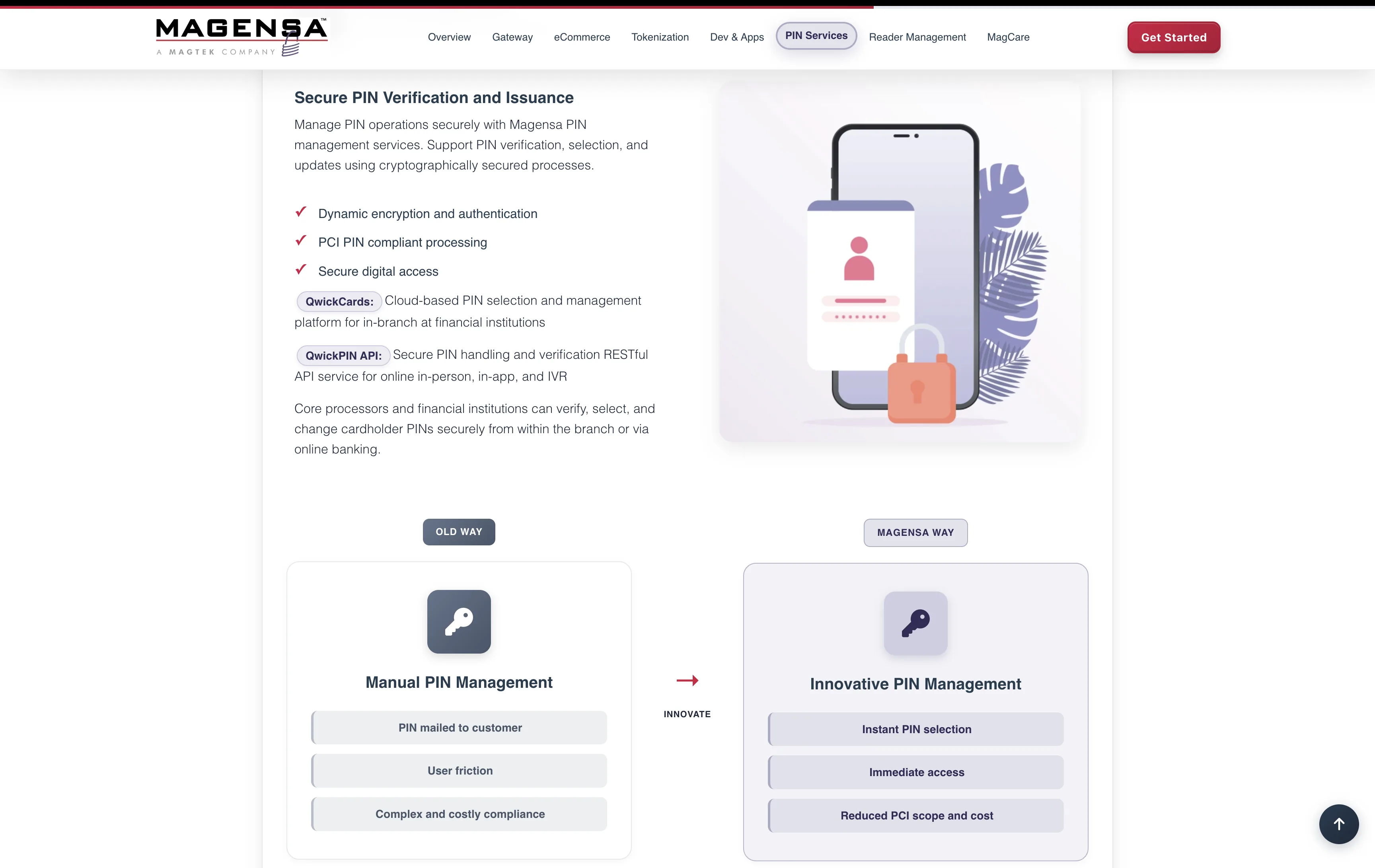
The "Old Way / Magensa Way" comparison runs across the product pages — a visual structure that carries the sales argument without paragraphs of marketing copy. The subsidiary feels like its own product because it is one, and the design treats it that way.